AppFolio Utility Management
Fully integrated software that automates the frustrating, time-consuming process of managing utility billing
Opportunity 💡
When I joined the team, AppFolio Utility Management as a product was still very new and the customer’s experience depended on the quality of customer service they received. You can think of it almost like The Wizard in “The Wizard of Oz,” where it appears that something is magically happening, but a person is behind the curtain pressing a bunch of buttons around the clock to keep up with appearances. That’s what our users were experiencing. “Automated billing” that was both mechanically turked and without a record in the UI of how the bills were being calculated.
After learning that Utility Management had not reached product market fit, leadership came to the team with a few business and customer outcomes that needed addressing in the product:
Reach the product market fit benchmark
Increase our margin
Support the user’s need to understand how charges are being calculated
Approach 🧪
Step 1: Secondary Research Analysis
I believe that there is always secondary research somewhere, whether it be from stakeholders themselves or a treasure trove of insights stored in a research repository. This project was no exception to that belief. I started by looking at the behavioral data we had in Pendo, looking for relationships and patterns that might be relevant to Utility Management.
I then explored the idea that customers have probably been sharing feedback through their service rep. Turns out, they were and these conversations or cases were already logged in Salesforce, but no one had done any analysis on them yet.
This, combined with what we learned from the generative research project I completed, a snippet of which can be viewed here gave me an understanding of the baseline of the product’s perceived value, customer sentiment and surfaced some opportunities to deliver value.
I felt like the team had enough data to start brainstorming and generating ideas. So I facilitated a design studio involving product, engineering and QA, broken out across three days:
Step 2: Cross-functional ideation activity
Day one, I presented all of this research in a slide deck and gave space for everyone to ask questions. The product manager and I also suggested some metrics to consider to track our progress: increased product engagement, decreased number of Salesforce cases and a decrease in the number of resident utility charges that get reversed in our system. We then gave the team the rest of the day to ideate and diverge on the following opportunity: how might we support our user’s need to understand how charges are calculated so that they can easily support their residents?
Day two, everyone got to present designs and give each other feedback. I encouraged everyone to have a “yes, and” mentality and avoid dismissing any ideas.
Day three, we did a MoSCoW activity where each team member weighed in on the what they believed to be the most impactful solutions and which assumptions they wanted to flesh out more and test.
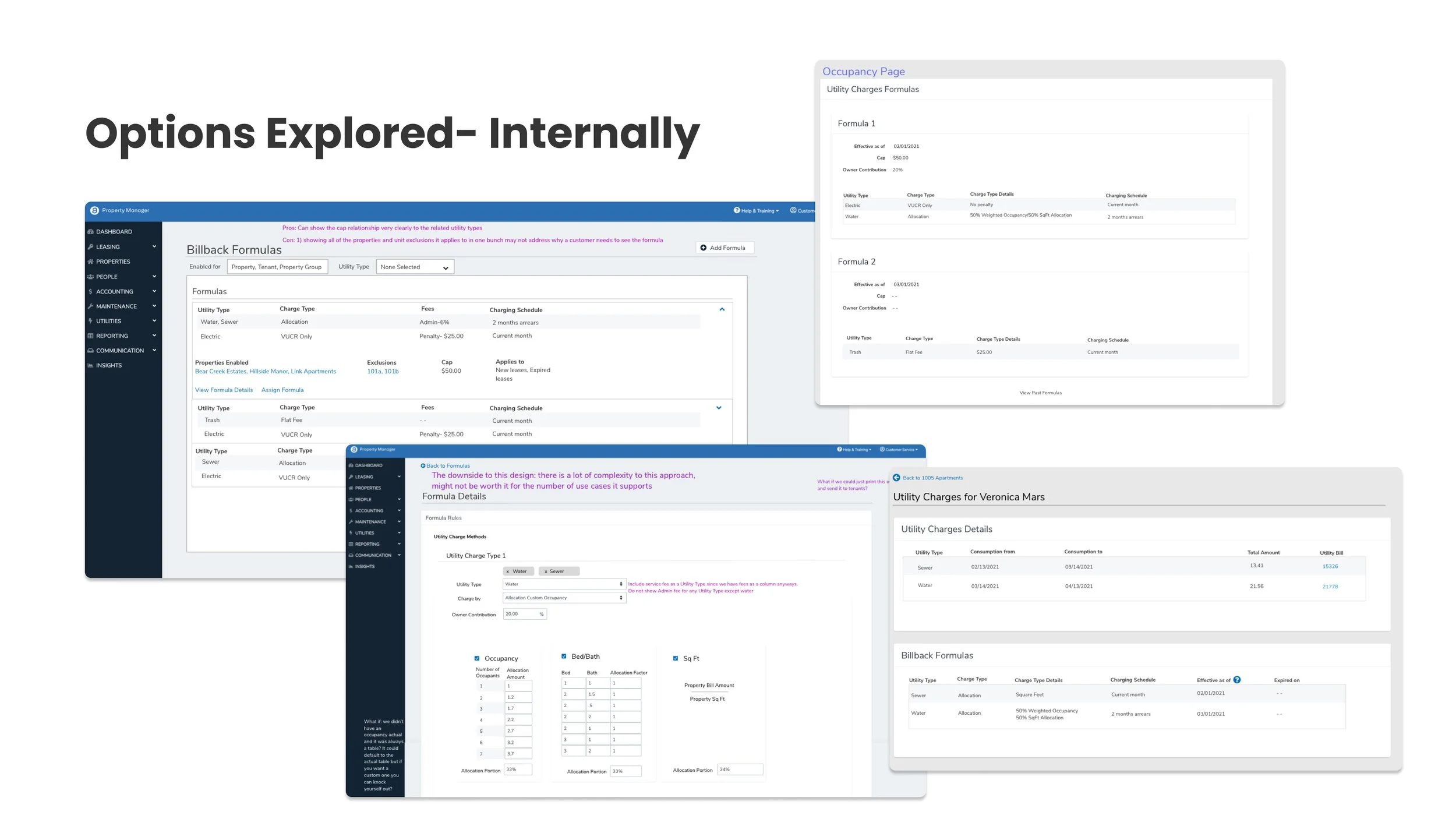
I then took some time to create mockups that reflected the ideas in the team, using UI elements and components that existed in the AppFolio design system.
Step 3: Gather Internal Feedback
I shared my changes with engineering and product. Our director of engineering was also present and one very crucial piece of feedback was shared at this time around level of effort that would have impacted development time significantly and it became clear to me that we needed to change the design approach. I also realized that the designs I presented would likely increase the user’s cognitive load. In other words, we would just be adding more junk to the junk drawer if we moved forward with any of the current designs.
I came back with some new ideas and after a good deal of thoughtful sparring and discussion, I proposed we add another level of navigation to the utility management experience and create a charge details page for each resident. Creating a new page entirely gave us some more screen real estate to work with. It was also consistent with how users were experiencing similar parts of AppFolio.
Step 4: Prototype Testing-RITE Method
We had a long list of assumed product requirements from previous user research and feedback. But we weren’t sure which ones were the most important to the most people. So rather than test small features or ideas in a vacuum, I took a different approach. I created a prototype that contained and expressed most of the things we heard were necessary from research. We would learn more about what was necessary or a “nice to have” based on the user’s behavior and feedback while using the prototype.
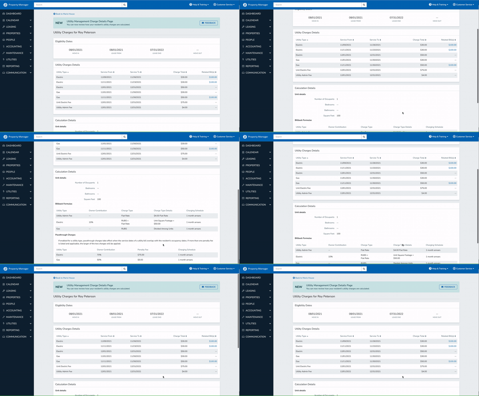
The above image shows how a small part of the design evolved as we learned through the prototype tests. My first approach in this section was to indicate that a bill was linked to a charge by showing the bill reference number as a way to differentiate each bill. That approach solicited a great deal of questions and hesitation. I quickly learned that my first design did not resonate with users in any property management role. Even using the column label "utility bill" was confusing because it could technically be referring to the resident's bill, not the property’s. The next approach included a few copy changes that tested slightly better. We then showed a third approach. This time, customers not only understood that a "related bill" was the utility bill for the property, they appreciated seeing the final bill amounts right away and expressed that in some cases using the link to navigate to the entire bill wouldn't even be necessary. Being able to just look at the total bill amount and the calculated resident charge would be enough to determine if the charge was fair and correctly calculated.
Another example of something we weren’t sure about before testing was how familiar customers were with utility billing industry terms and abbreviations. After a few sessions, we learned that many users did not know industry terms. Furthermore, how they were presented did not match their mental model. So, I went back to the team and I simply asked the engineers how these configurations were structured on the backend. And, that’s how I expressed it in a second iteration. And, this time, even users who didn’t use this method understood what they were seeing on the page.
Conclusion 🧐
Looking at the Pendo data in the beginning, it felt like users were on a treasure hunt, searching for answers in disparate areas of the product. So we determined that a good traction metric for us would be to observe adoption of our new happy path vs the previous option. Based on what we saw after release, our solution provided the data they were looking for in a better context since the adoption of our review area was so high it became the new most common path in the flow. Customer service cases also decreased by 20%, contributing to an increase in our margin. We believe this is because customers had access to the right data and were able to answer many questions through using the product.
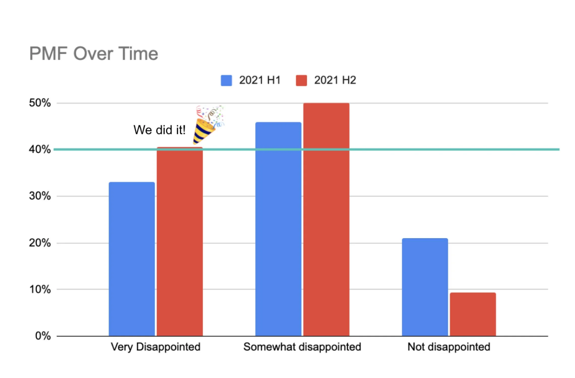
Our leading indicators proved to be informative as we completed development and wrapped up our second round of product market fit survey analysis for the year, going from 33% to 41% fit. This was a huge milestone for the business line as it was the first time we had ever reached that benchmark successfully.


