AppFolio’s Resident Page Redesign
A data-driven approach to reducing a user’s cognitive load on AppFolio’s most visited page.
Opportunity 💡
“The user experience is terrible for using the experiences of actual user to improve the product. Your UX focus is on making the product better to generate more sales, but you leave the actual users behind. ”
— Quote from NPS Customer Feedback
During periods of high growth at a company, it can be challenging to ensure that a product maintains its ease of use. High growth usually means more features added. In a product that prides itself on being a system of record, more features often mean more screen real estate gets used up. The company was noticing that our lagging success indicators were trending down, particularly NPS and SUS scores.
Meanwhile, our research team and data science team had begun to investigate adoption of features, new and old. And they stumbled upon an interesting pattern. Of the most visited/used pages in AppFolio, 80% of the features were used less than 1% of the time.
A hypothesis was formed: Leadership believed that we could explore increasing our product’s ease of use by decreasing the user’s cognitive load on highly adopted pages.
This insight was raised to design leadership and I was one of the few designers tasked with exploring how we might explore and test this idea.
Approach
Baseline Usability Testing
Everyone agreed that starting with the most visited page, the resident page, was the place to test this hypothesis. With our scope narrowed down, we started our discovery by establishing a baseline of what the ease of use was for common tasks on the page. We did this with a formal usability test with current users. We measured time on task, pass/fail rate, SEQ (single ease use question), and monitored for scrolling and inspection patterns for each task. A few learnings worth noting were:
42% of users failed a common task located at the top of the page
SEQ was generally very high for the above task
For every single task, ~80% of users would scroll during the first attempt, even if the task was at the top of the page
Users often failed tasks because they could not tell whether or not they had completed it for a single resident or for the entire unit
“As you go down the page, things tend to blur a little bit and you really have to pay attention to reading each header.”
— Usability Test Participant
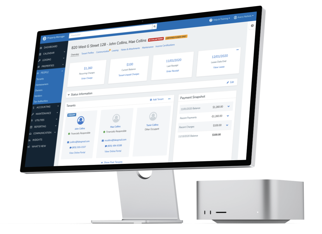
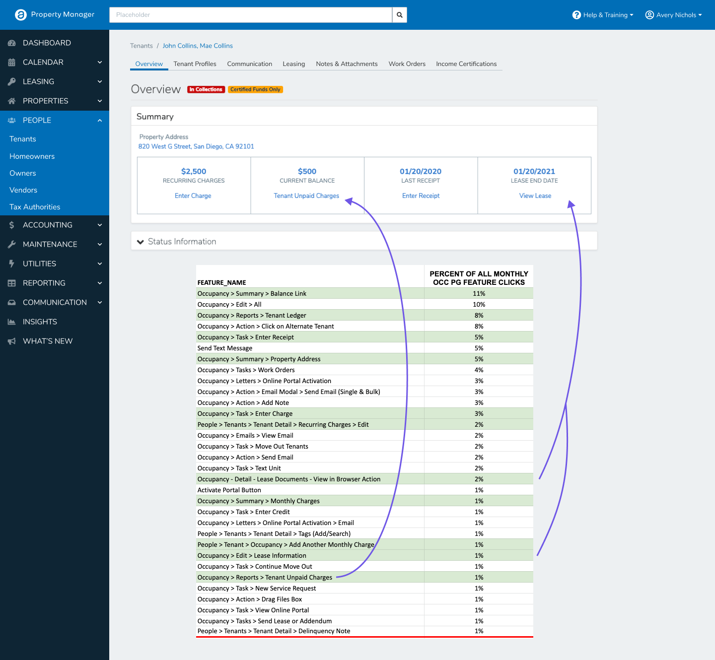
This is the page the participant is referring to
👇🏻
The user has a point! There is a ton of content to scroll through, here.
Card Sorting
We also performed a card sort to inform our approach to the information architecture of any redesign effort. It also gave us the opportunity to ask customers about what we observed in the usability test regarding resident information and occupancy-level information. What would they call tasks applicable to all residents in a unit?
Data Driven Design Mobbing
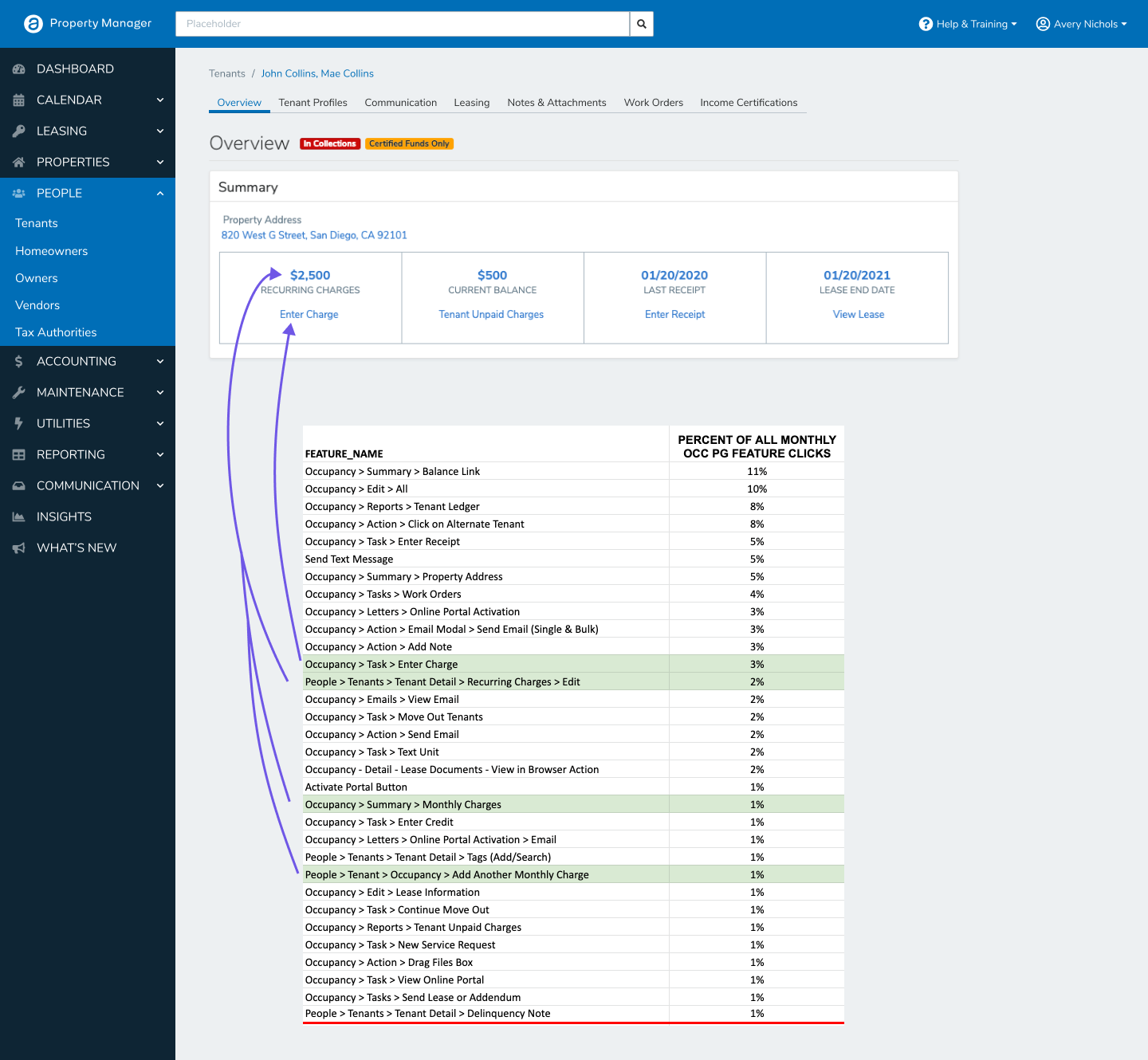
Now that we had all of this generative research guiding us, we pulled up the quantitative data our data analyst had gathered regarding feature usage. We looked at everything above the 1% line and, over several Zoom calls, where we took turns to share our Figma screen, redesigned the page using design system components, while letting the behavioral data dictate the size and prominence of content and features.

And then we tested it, right?
Almost, but not quite!
Data Driven Design Mobbing Part 2
Then we explored other constraints to challenge ourselves and plan for constraints that might come up in development: What if we can’t change the navigation pattern? How contextual should we make alerts? Now that there is more space on the right side of the screen, what could we use it for instead?

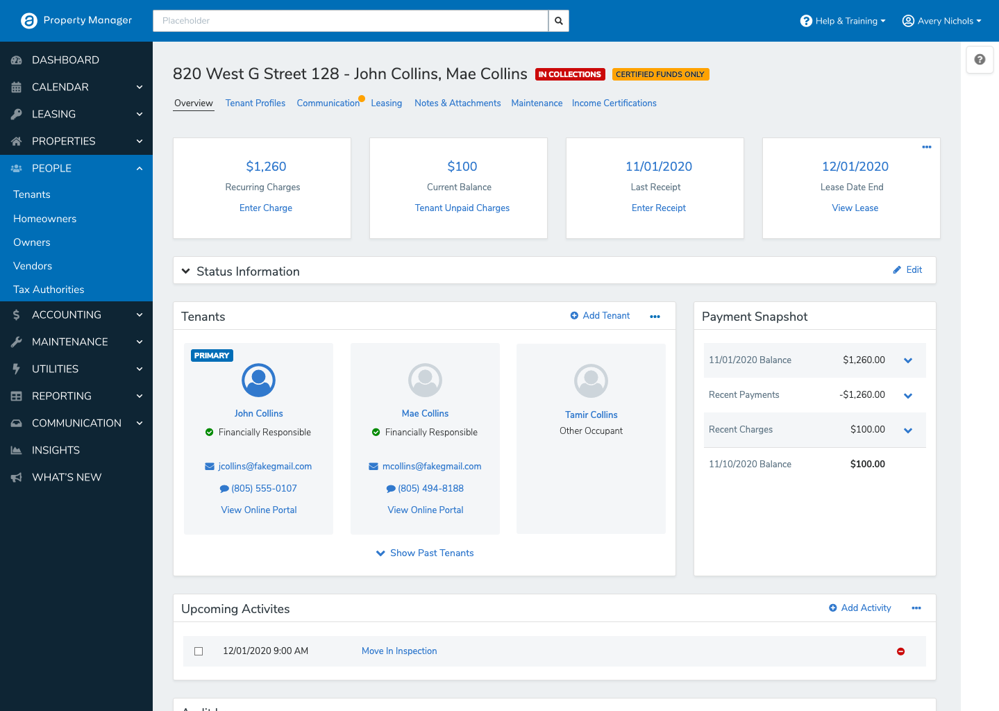

After presenting to stakeholders, we decided that realistically, the middle design was the one most subject matter experts believed would increase ease of use and customer value. So we started there.
Redesign Testing Results
We took the tasks from the baseline test and used them again for this new design. We recruited from a mixture of current users and non-users who worked in property management. Overall, these were the most significant results:
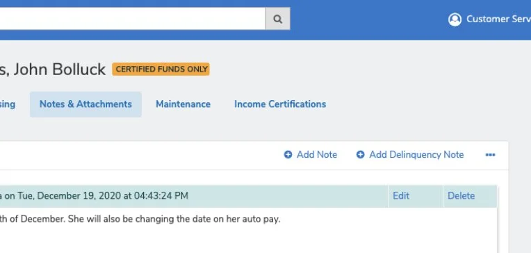
82% increase in successfully adding a Note.
Scrolling also decreased by 20% on this task.
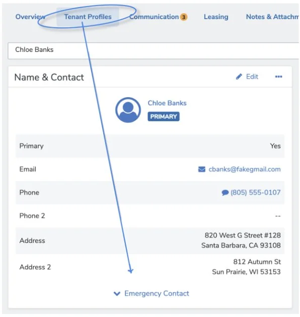
75% of participants successfully found the Emergency Contact.
For this very same task, 42% of customers failed this task in the current design.
Conclusion 🧐
The impact this team had on the organizational structure of the product department for the following year was significant. After presenting our findings, product directors were pitching what needed to be prioritized to our SVP of product and attention to our information architecture was raised as most pressing with the findings from these tests given as evidence. This led to a large portion of product’s budget being allocated to IA efforts and a full re-org shift to platform teams over segments to insist on a more holistic approach to problem-solving. Many of the components tested in this redesign (i.e. our secondary navigation layer and our new contextual task dropdown pattern) were also later adopted as a part of the AppFolio design system and can be seen in use today.

